Featured Project:
Kids educational
summer camp
Logo Design
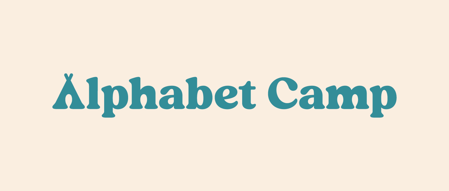
The primary color is a true teal to represent the welcoming and upbeat spirit of their unique learning environment. The camp-inspired teepee tent mimics the letter form of an ‘A’ and is integrated into the logo type.

Project Overview
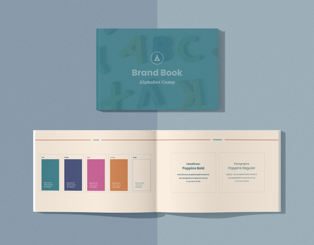
This brand’s look was inspired by “Chicka Chicka Boom Boom,” using colors that reflect a fun, youthful vibe, perfect for the program’s target audience of small children.
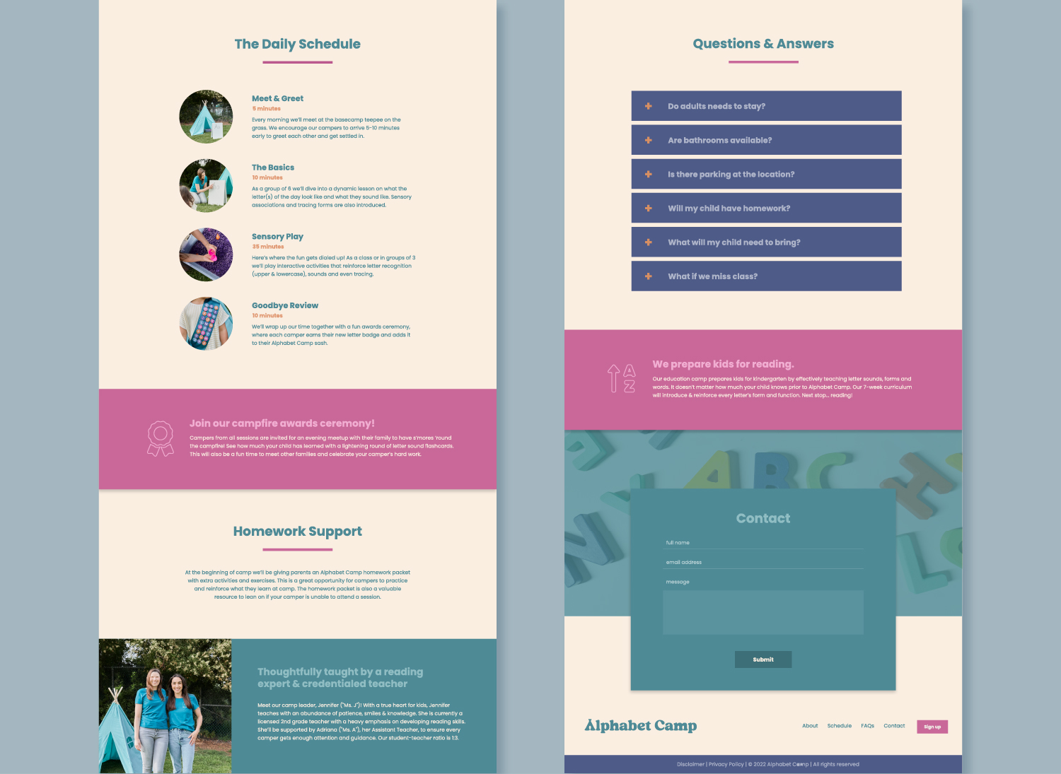
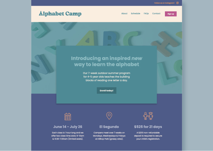
We structured the website to address all parent concerns before enrolling their child, keeping it simple yet comprehensive. A single-page website like this acts as a sales funnel, guiding visitors through the pitch.


