Featured Project:
Real Estate Agent
Branding & Website
Logo Design
Strong logos feature an equitable mark. In this case of this realty business we coupled the ‘G’ in her name with a skeleton key, symbolizing the home purchases she helps her clients with.

Project Overview
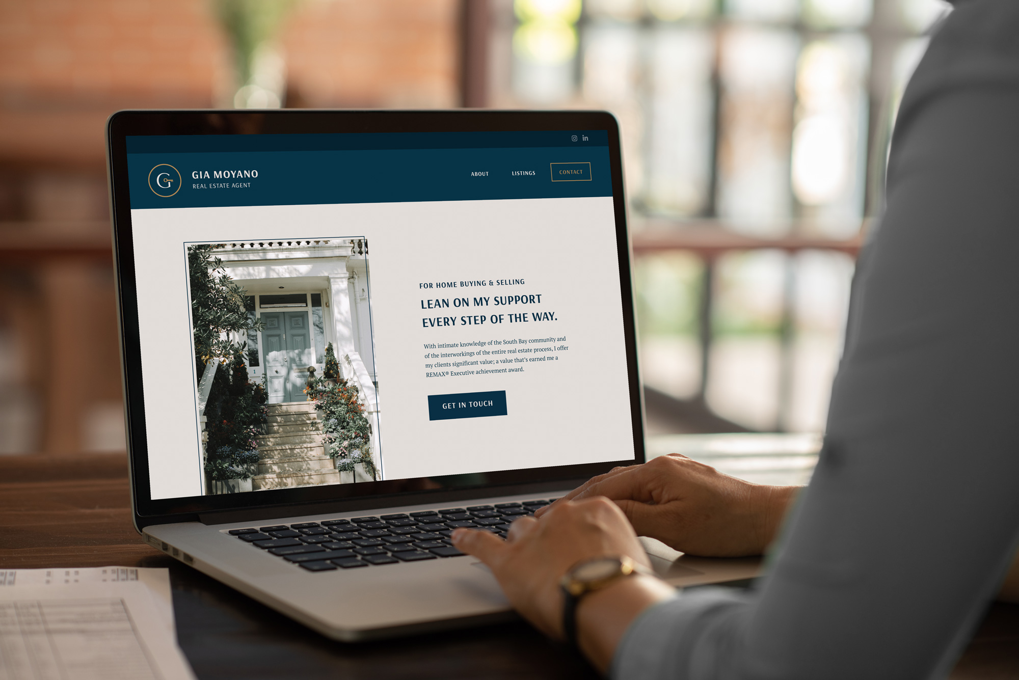
For the design and layout of this website we structured the website around 2 primary objectives:
1) What sets this real estate agent apart from others?
2) What listings are available and what properties have been sold?
With clean and polished design we were able to create a lasting impressions for users. The feel evokes a fresh take on professionalism.
Client Testimonial
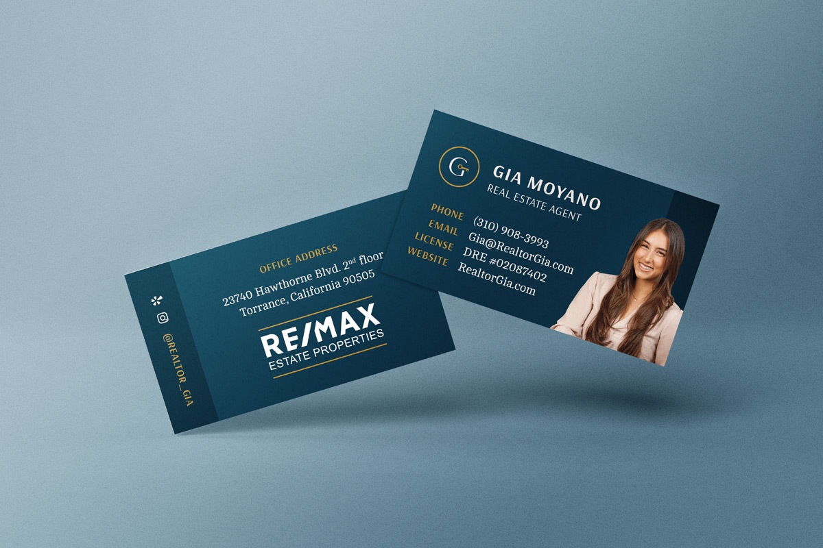
They captured the exact feel I was going for. The logo was love at first sight. But to see it all come together makes me feel so relieved. Finally, a cohesive color palette and overall aesthetic that ties my customer touch points together, from the website to my business card and other collateral. The entire process was cost-effective and the final product was perfect.


