Featured Project:
Child Development Branding & Website
Logo Design
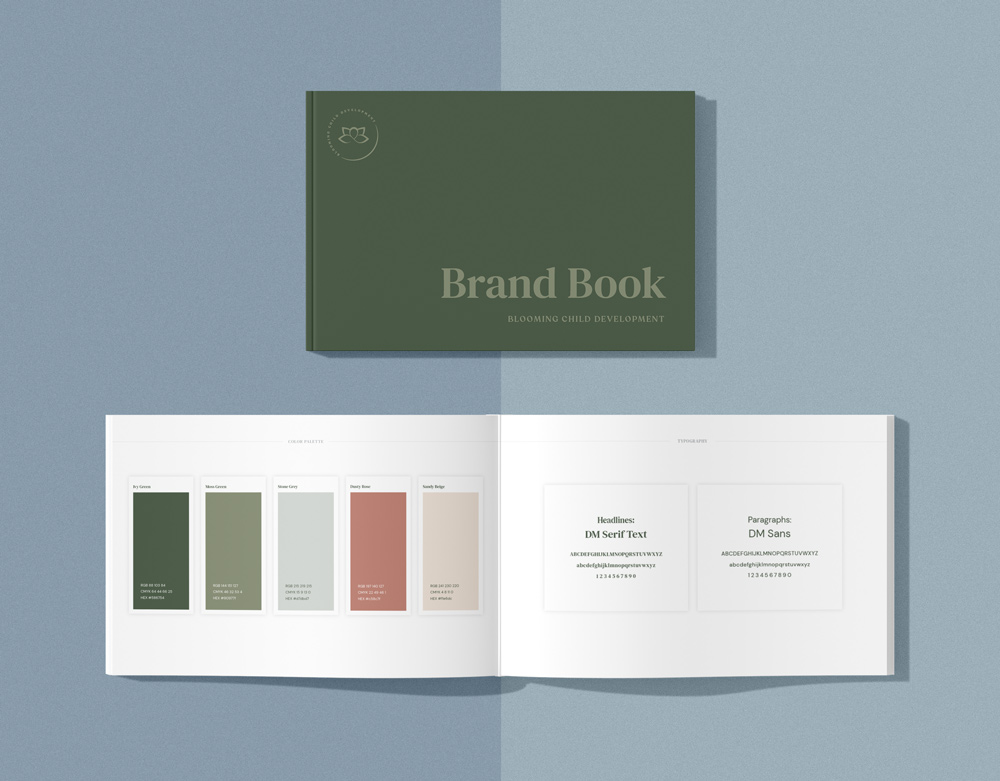
The primary colors are muted greens with an earthy, natural feel to capture the delicate growth of a child’s formative years. The rounded shape in the center alludes to a child, which contrasts with pointed petals in bloom, spread out like arms.

Project Overview
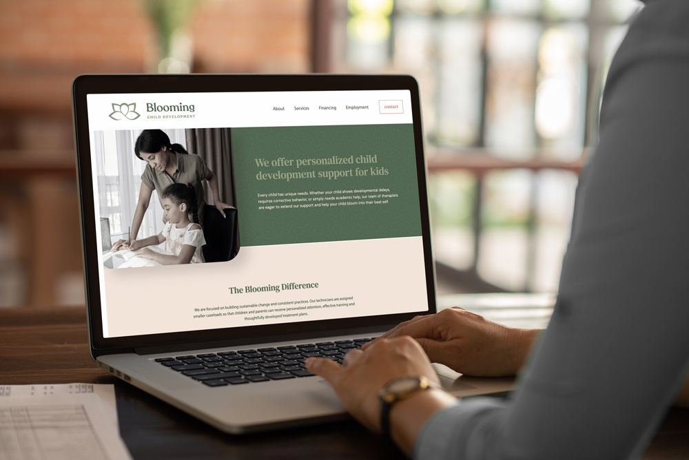
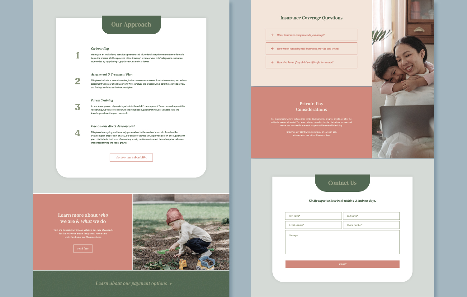
Building a reputation begins with branding. We set the tone by following the founder’s vision for a friendly, earthy, and professional identity.
Colors were inspired by childhood growth and beauty. As for layout, we focused on easy navigation, aiming to answer a prospect’s questions and provide trust and reassurance.
Client Testimonial
They have done an amazing job creating my website and designing my brand from scratch. They were able to take a concept and make it into a dream. I could not have imagined a better site!


