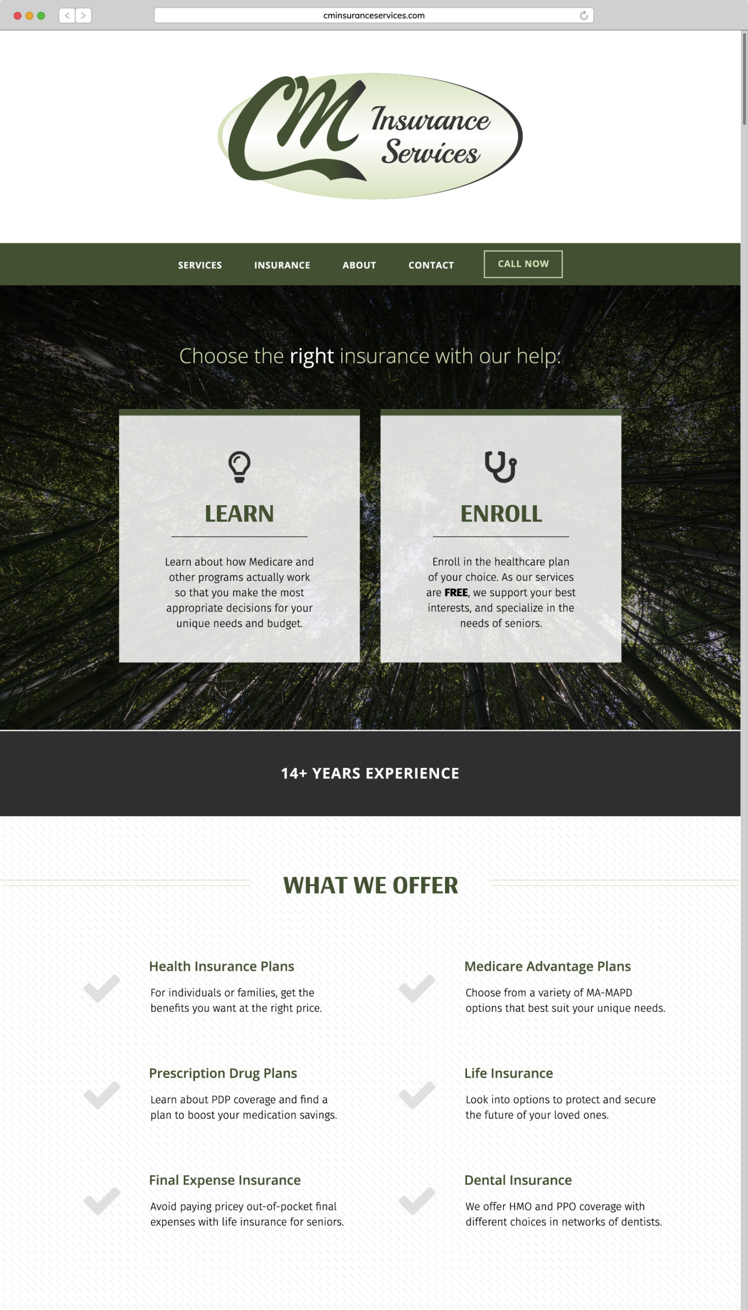
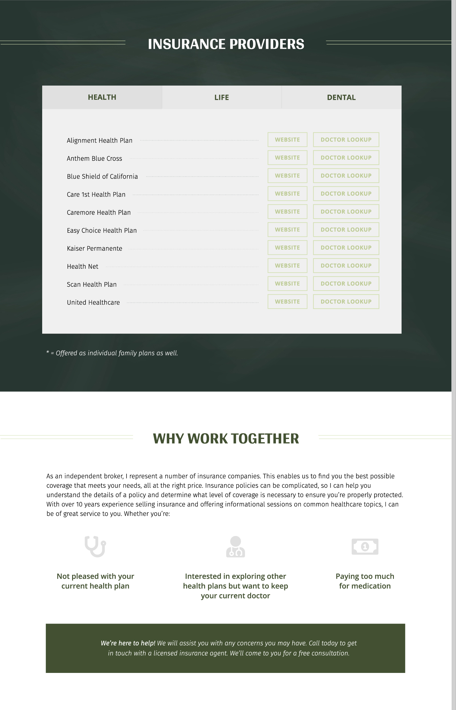
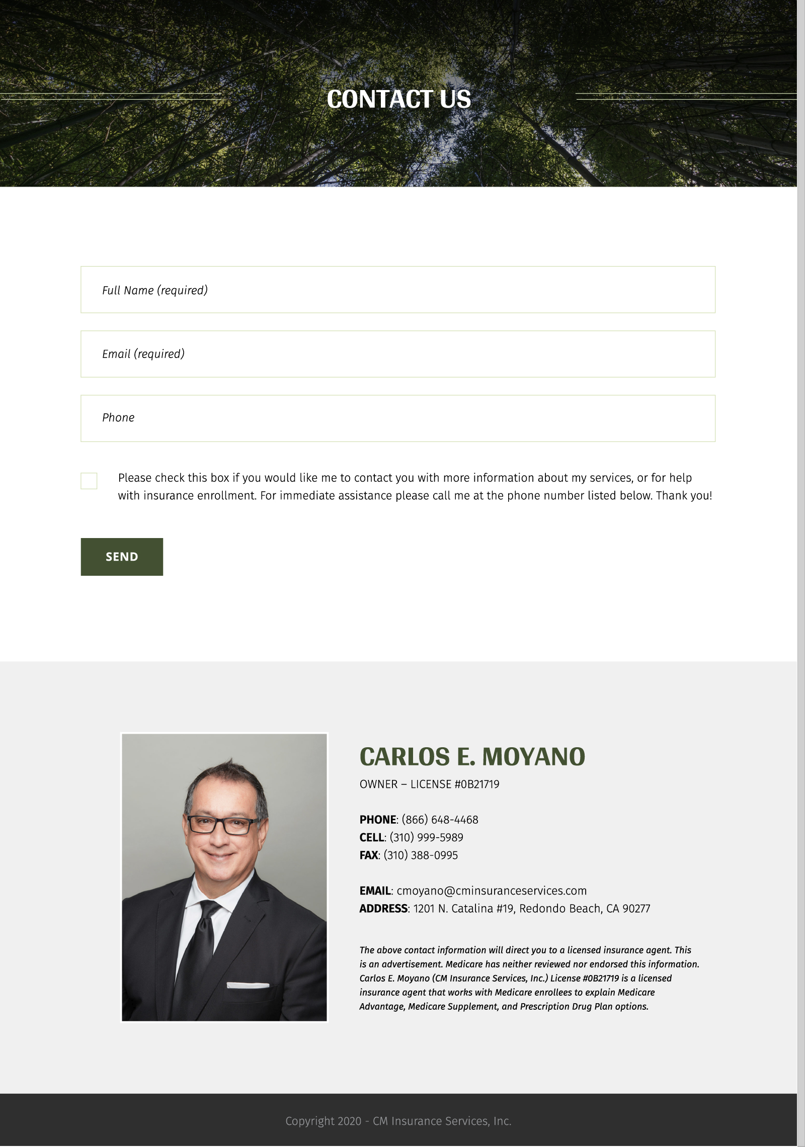
The conceptual objective here was friendly professionalism and the audience majority was senior citizens. This meant that both the aesthetic and functional properties of the website would need to be approachable and easy to understand. As far as content was concerned, our client sought to plainly summarize his business and basic need-to-know information.
We adapted the design to accommodate a single scroll layout. This provides easy navigation to users who are focused on understanding the content in a natural “nice to meet you” flow. It was also important to counteract seemingly complicated subjects (health insurance) with clarity and organization.
Insurance Agent Website


Client Feedback
“I wanted a digital business card, with more than just my contact information. I wanted to elaborate on my services in a modern, easy-to-understand way. The website they built for me was perfect. It’s just what I needed. Now that I have the foundation, I can see the possibilities when it comes to making my website even richer with content and resources for my clients. So grateful for their patience in educating and guiding me through this process!”
