Featured Project:
Consulting Firm
Branding & Website
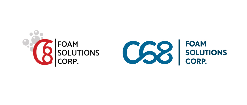
Logo Design
The text of the original logo was in need of some weight to counter balance the weight of the C68, while the bubbles compromised the professionalism they were after. Now, the C68 letterform has cohesion and better distinction.

Project Overview
Websites built from scratch need extra help in copywriting since there isn’t any copy to recyle.
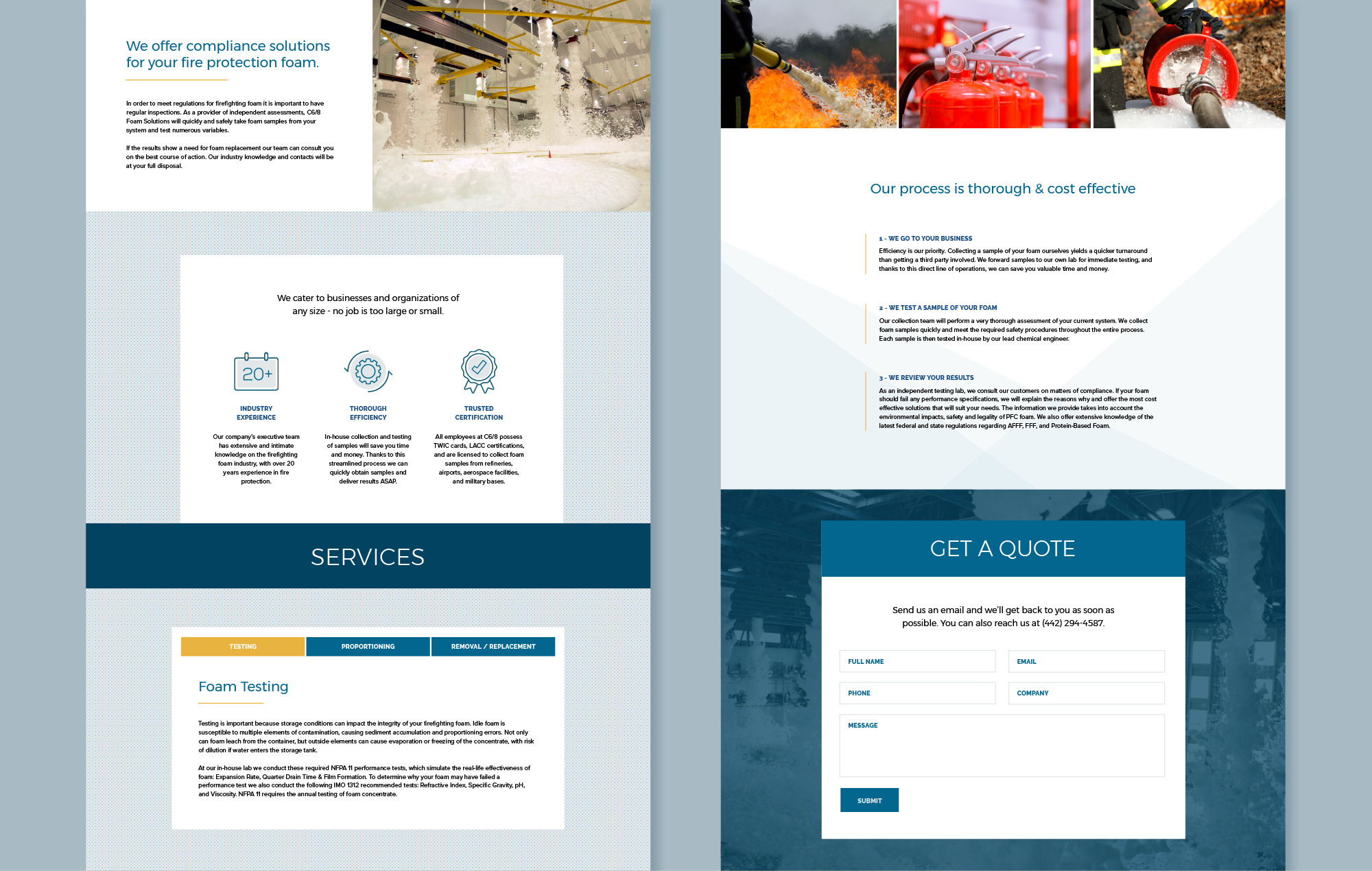
For this consulting firm we simplified a seemingly comflicated business model into organized and clear sections.
This website was a single landing page, with menu items that jump to different parts of the same page. A layout like this is great for companies that want a short and sweet pitch for their business.
Client Testimonial
“We love it! The website looks amazing, thank you so much for all your hard work and being patient with me!”


