Featured Project:
Fitness Consulting
and Training
Logo Design
In an effort to reintroduce Dan as a brand and not just as a business we created a logo that clearly identifies his specialty with an icon mark that he can stamp on fitness gear for his clients.

Project Overview
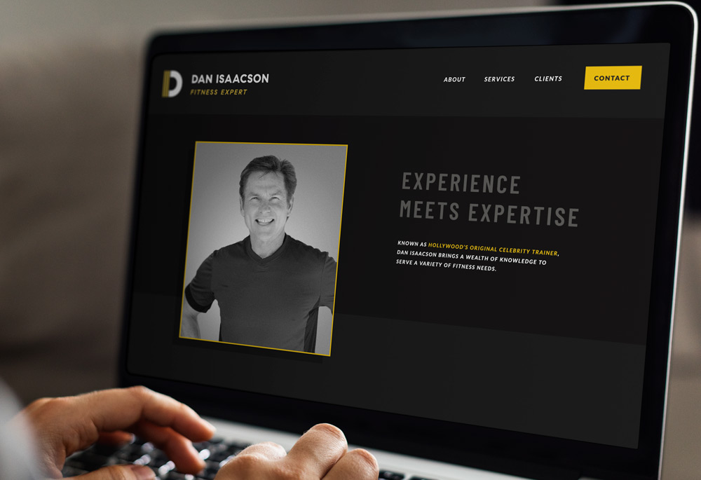
When we scoped the original website it was dated and missing a memorable brand look.
Our proposal injects a full dose of personality that carries an athletic but modern feel. Another big difference? The layout was simplified and services were clearly communicated.
We were also able to recycle Dan’s photo library with old school black-and-white edits to tie all the images together. Not only did it make the site cohesive but it also keeps the images from aging his site, especially since there were no recent assets to use for the new website.


