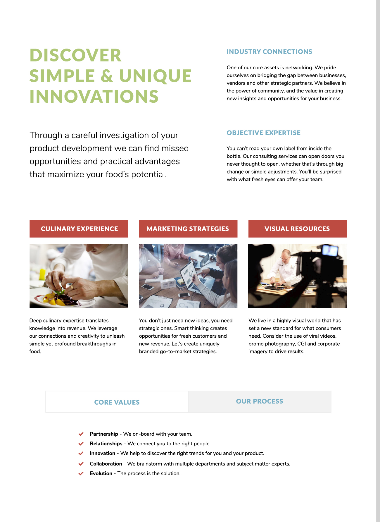
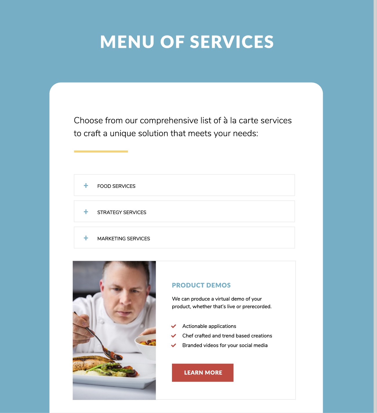
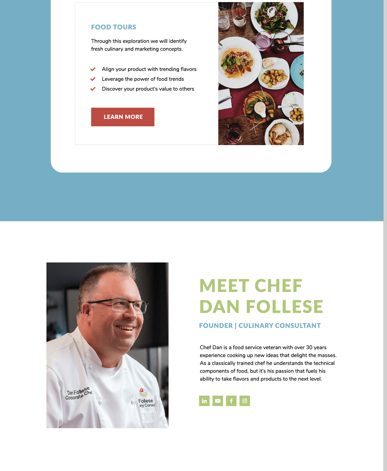
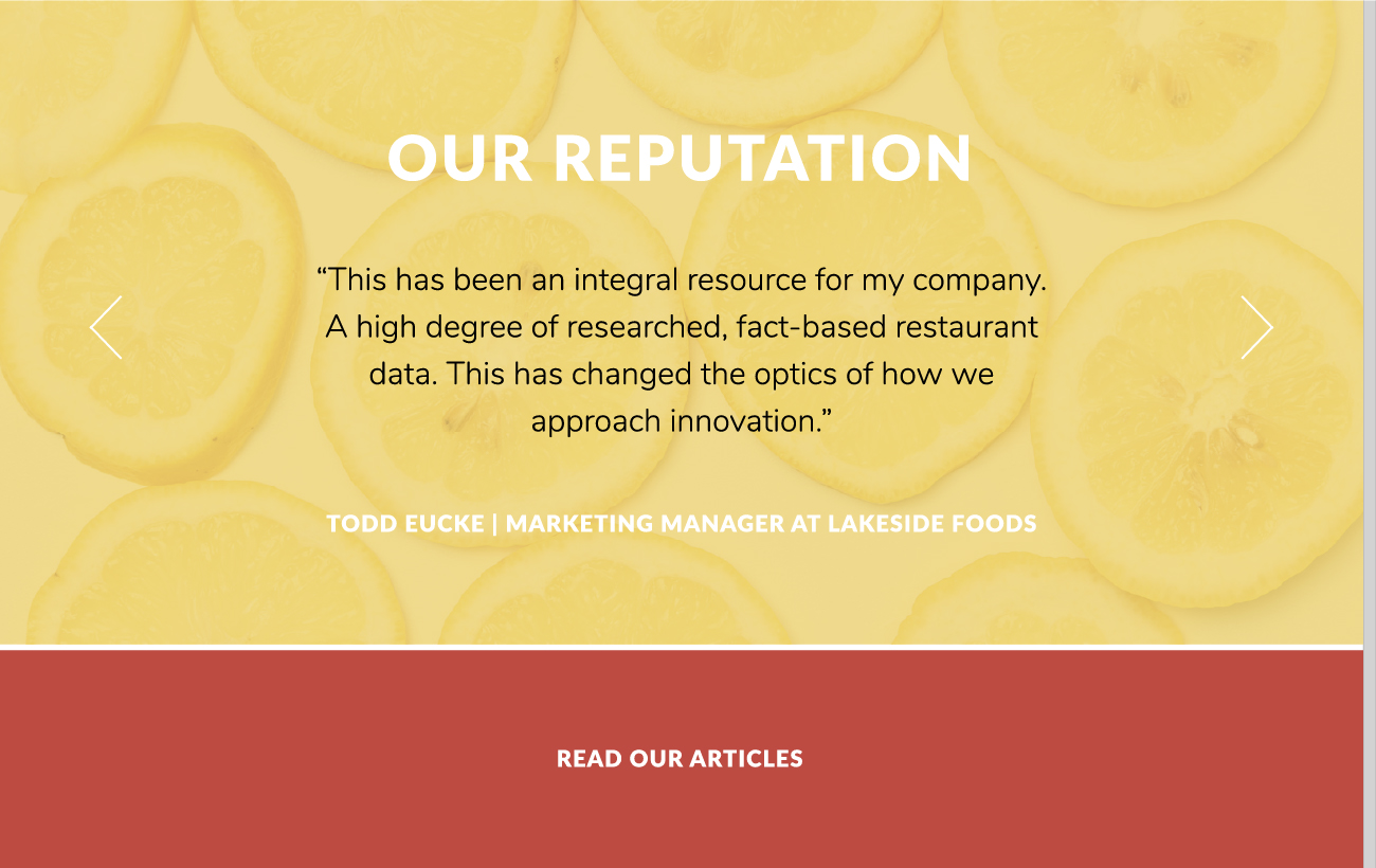
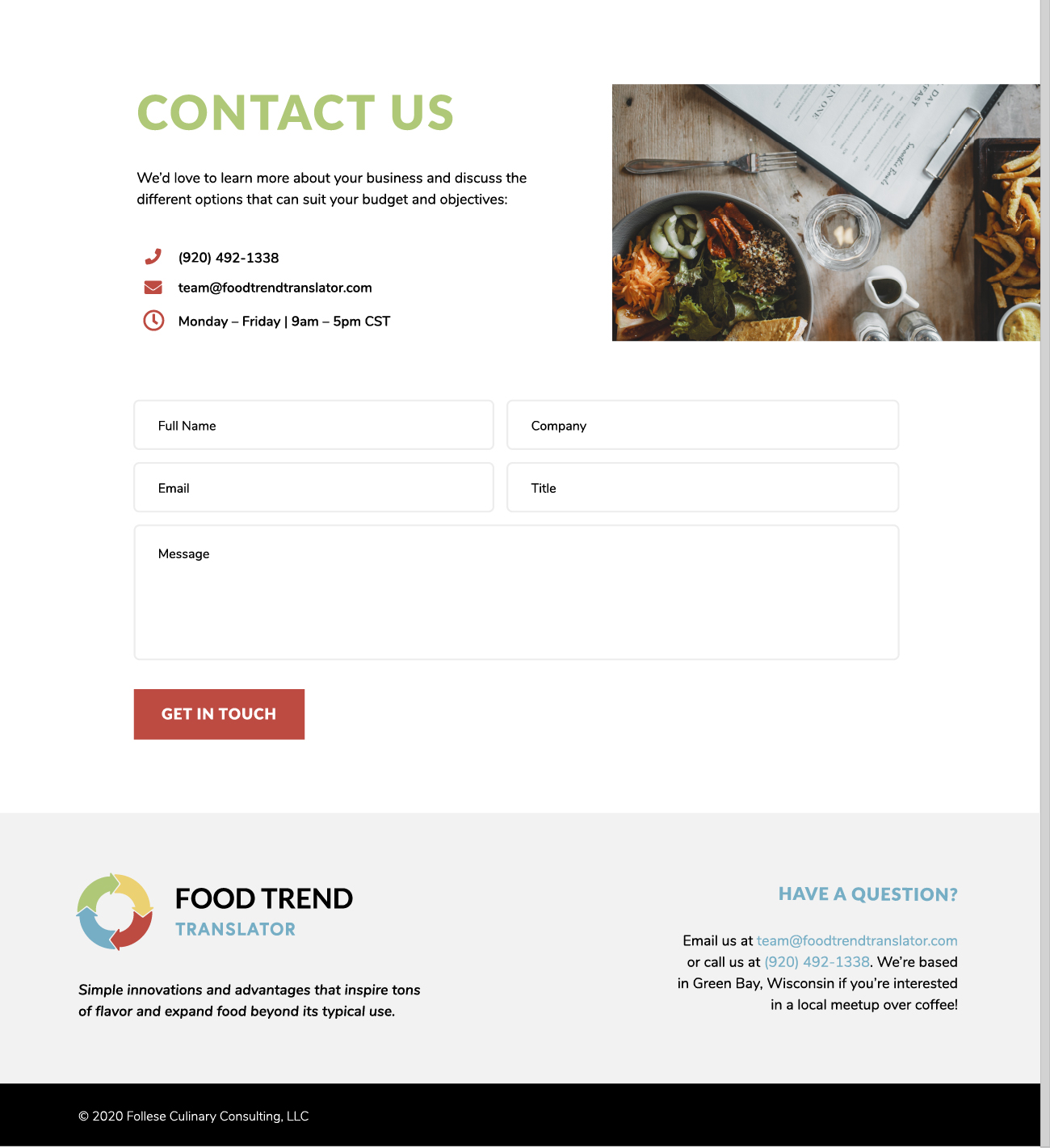
When you offer a suite of services it’s important to simplify your description of each offering. The best way to approach this is by (1) paring down the copy so that it’s short and sweet, and (2) visually breaking up your content with hierarchy and color. In the case of this consulting company, that’s exactly what was needed. With a refreshed logo and a vibrant color scheme users that visit site can now better understand the breadth and depth of their services, and see the value in what they create, instead of getting confused or overwhelmed by too much content. Organization is key, and that’s what we do best.
Culinary Consulting Website

Client Feedback
“The team at Johnson design were fantastic to work with, my previous website was a disaster and they were able to transform it into a story that made sense to everyone. They not only helped with an updated website they also refreshed the logo to be more effective on all social media and web formats. I am proud to share my website now that Hunter and Adriana have given it a new life and purpose. A special thank you for the great job you did!” – Dan Follese
