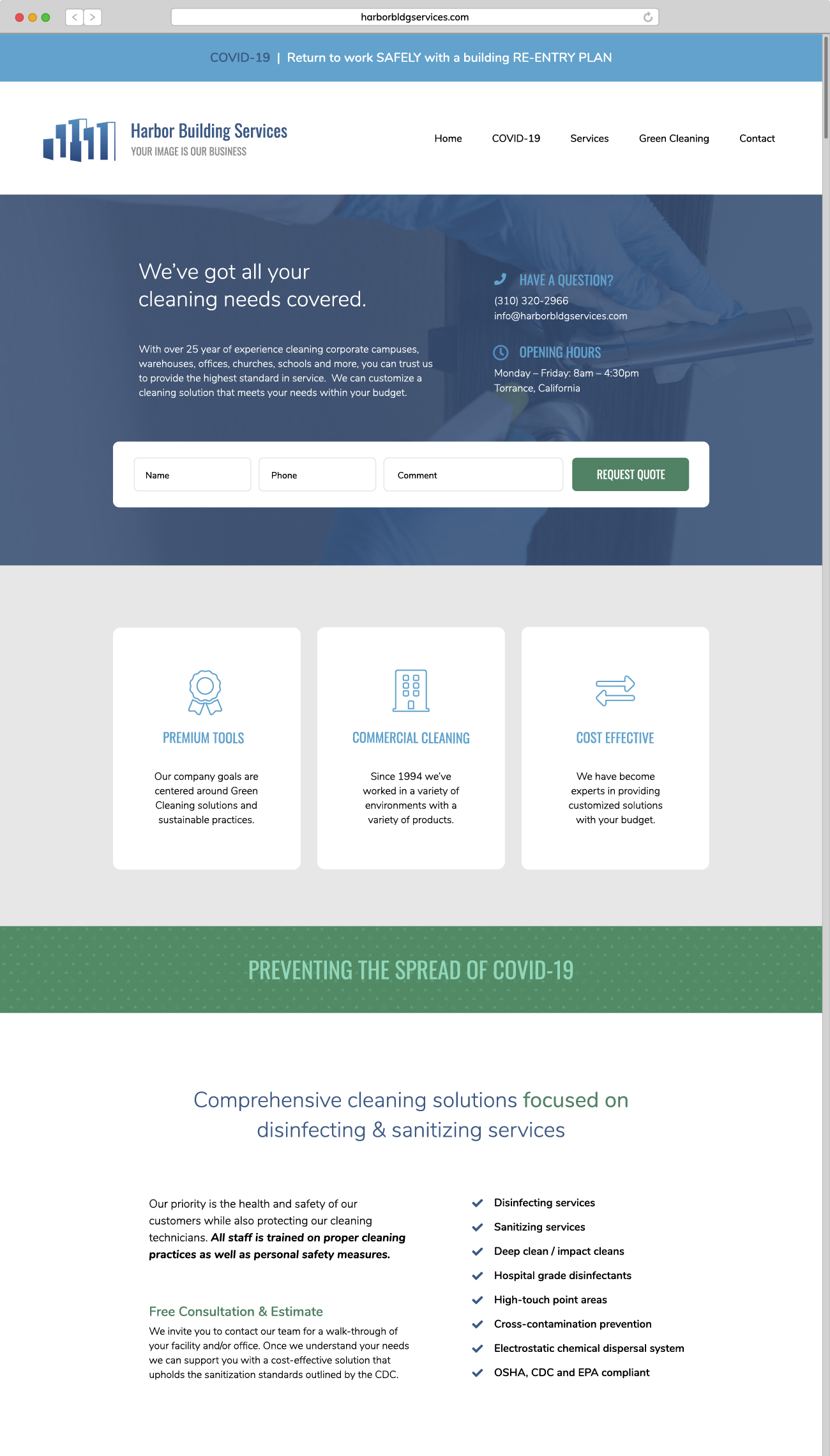
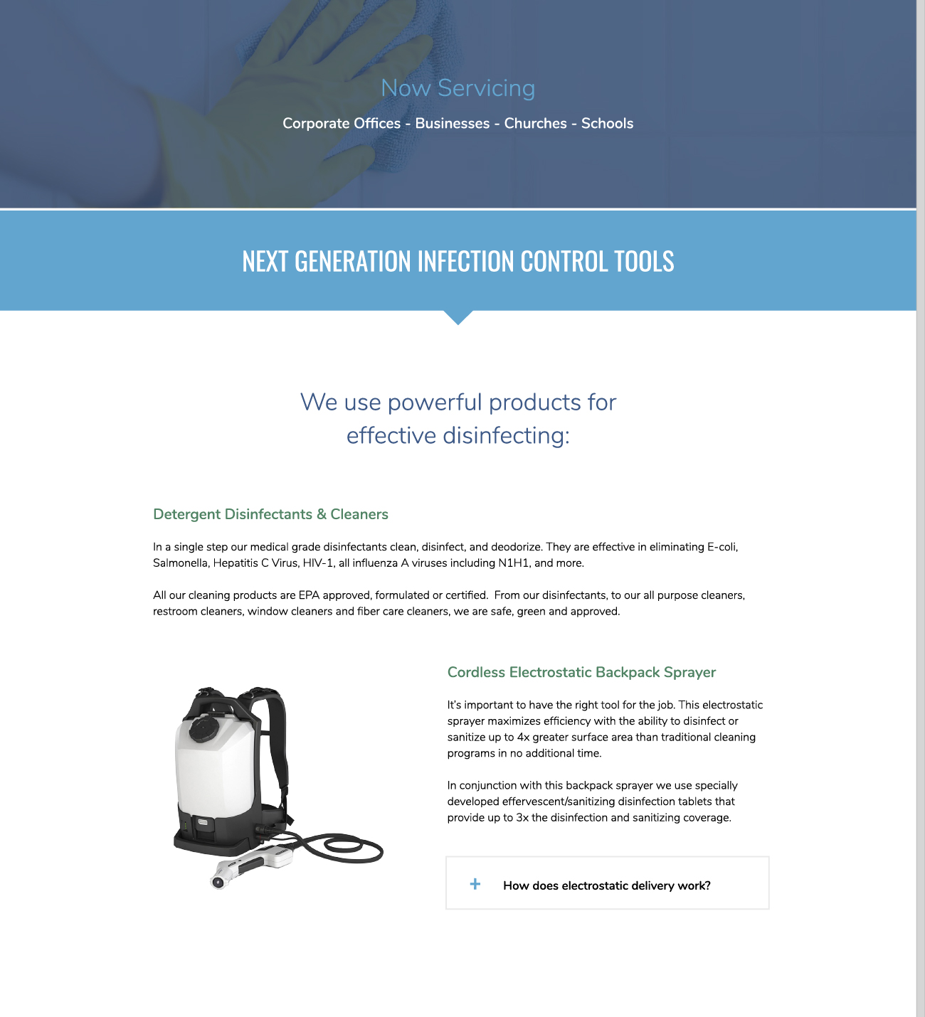
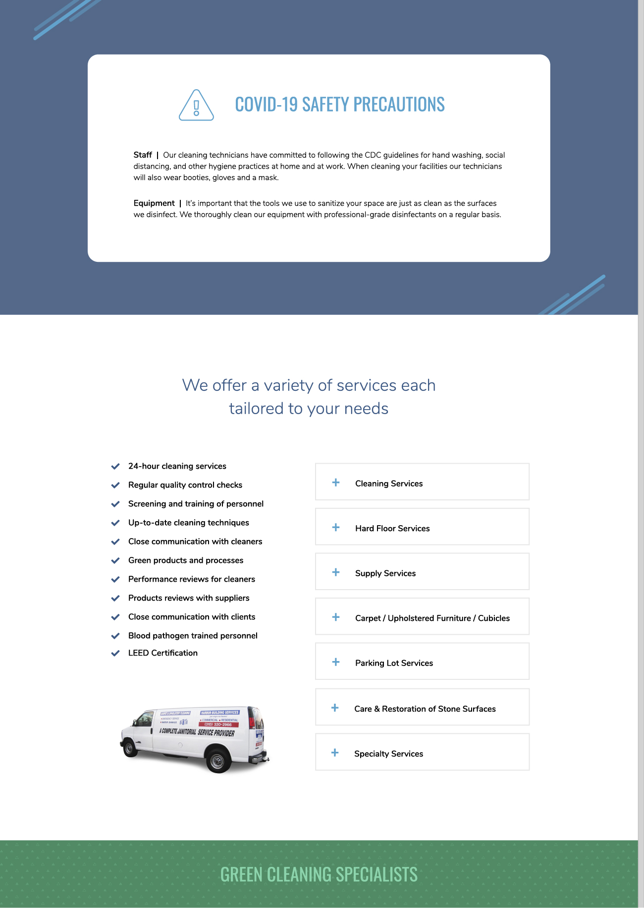
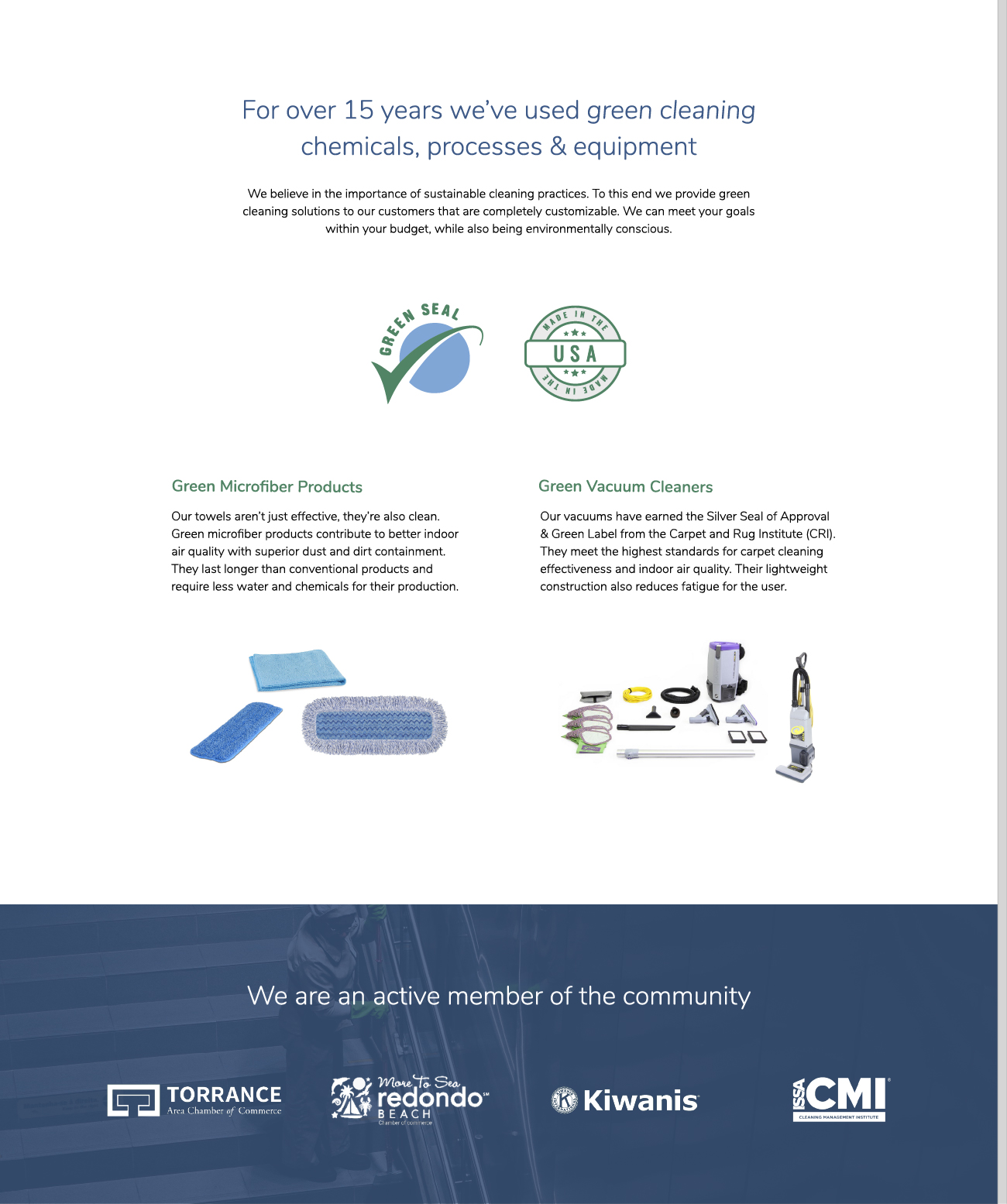
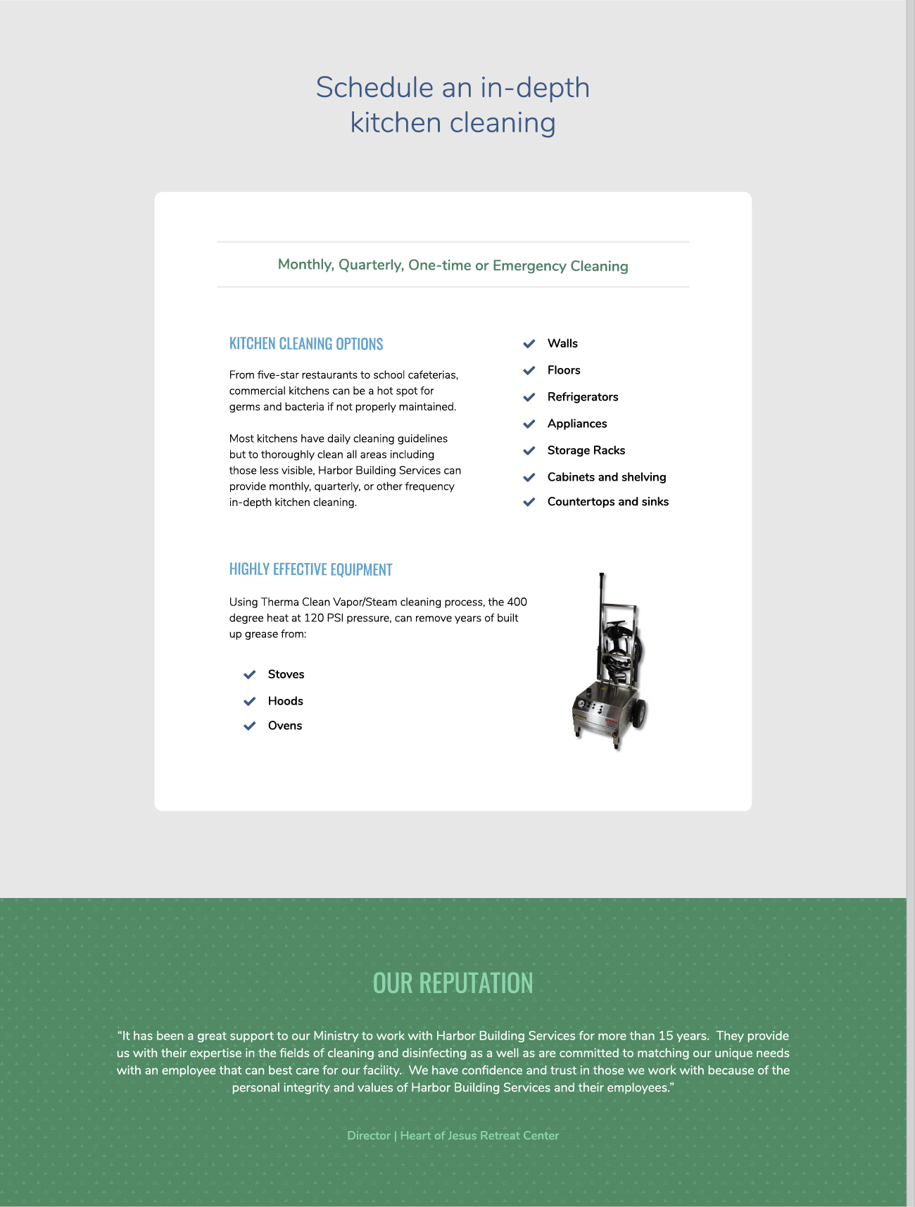
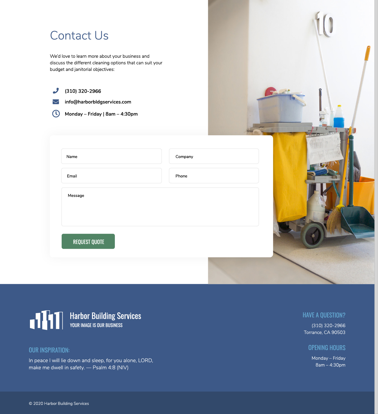
It was important to construct the homepage for this janitorial services company in the form of a pitch, with a hierarchy of content. The most basic, need-to-know information opens the website and as a user scrolls down they learn more about the details. Not only is it more cost-effective to design a single-scroll website, but it also organizes the company brief into a fluid package, allowing potential clients to efficiently digest information without having to jump around to different pages. It guides users to the ultimate call-to-action, which is to request a quote through the online form.
Single Page Website
Client Feedback
“We were fortunate to get connected with Johnsons Design for the work on our outdated website. They took our content and brought a whole new look and feel to each segment. The information layout was well organized and logical in progression, easy for a prospective client to follow. The communication was great, Adriana was very responsive to our questions and input and was quick to let us know if she had any questions so the entire process went very smoothly. I would highly recommend Johnsons Design for any of your marketing design needs.” – Hester D.
